Brand system
Strategy
VOL/9 is built around the idea that music is not only heard — it is felt, seen, and experienced physically.
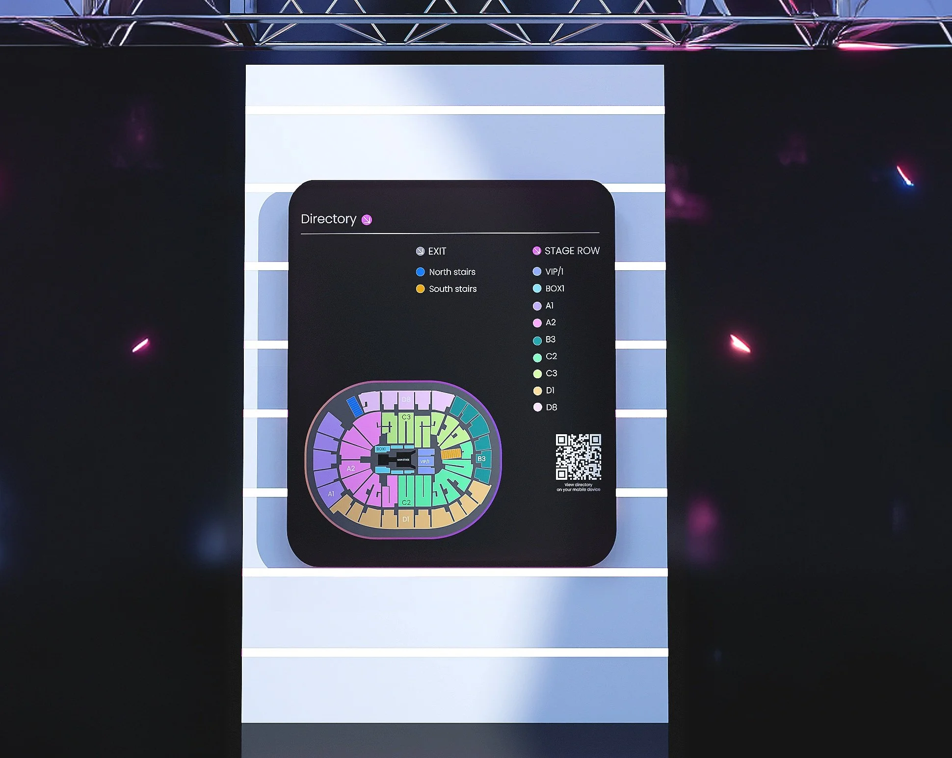
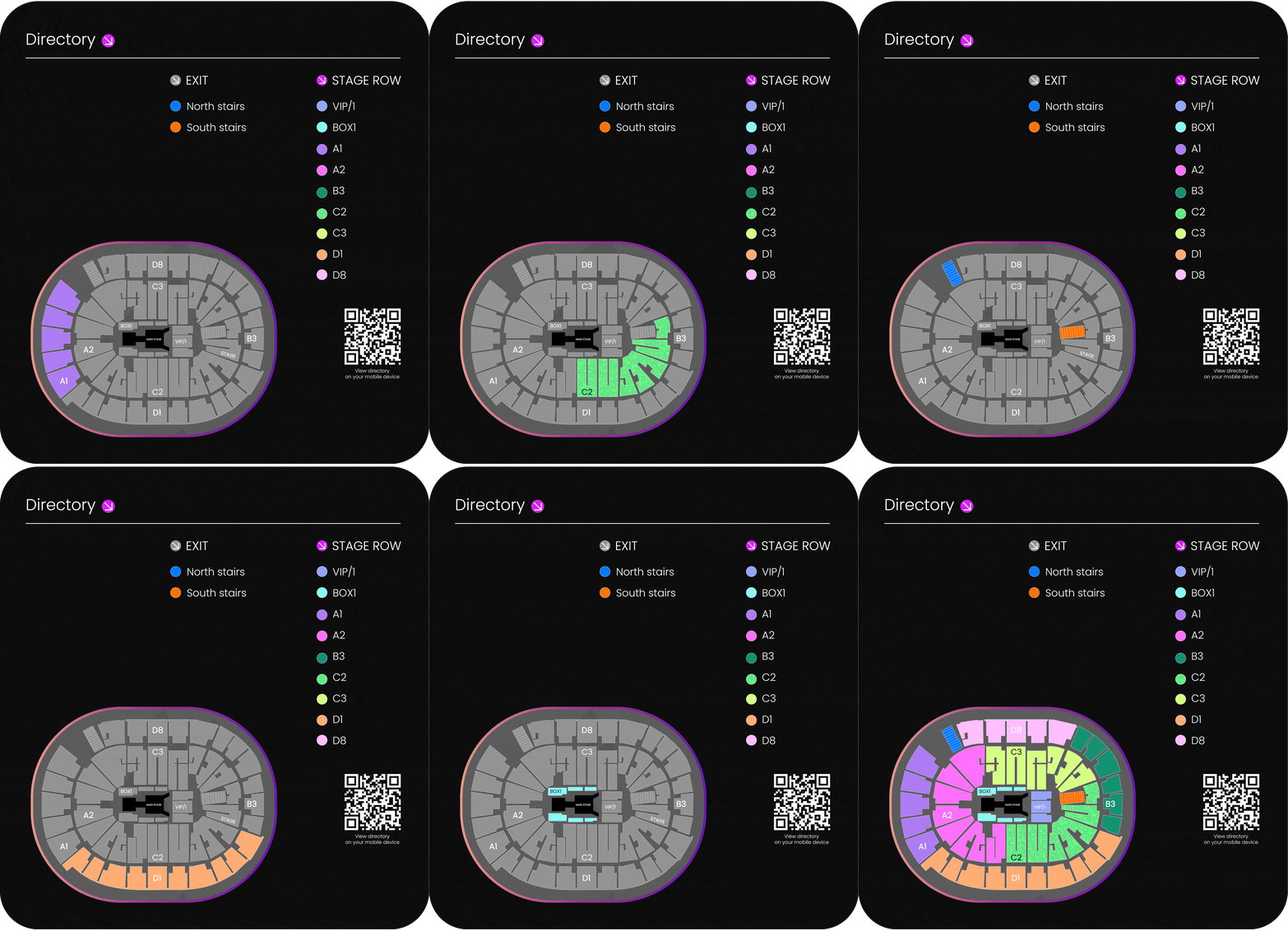
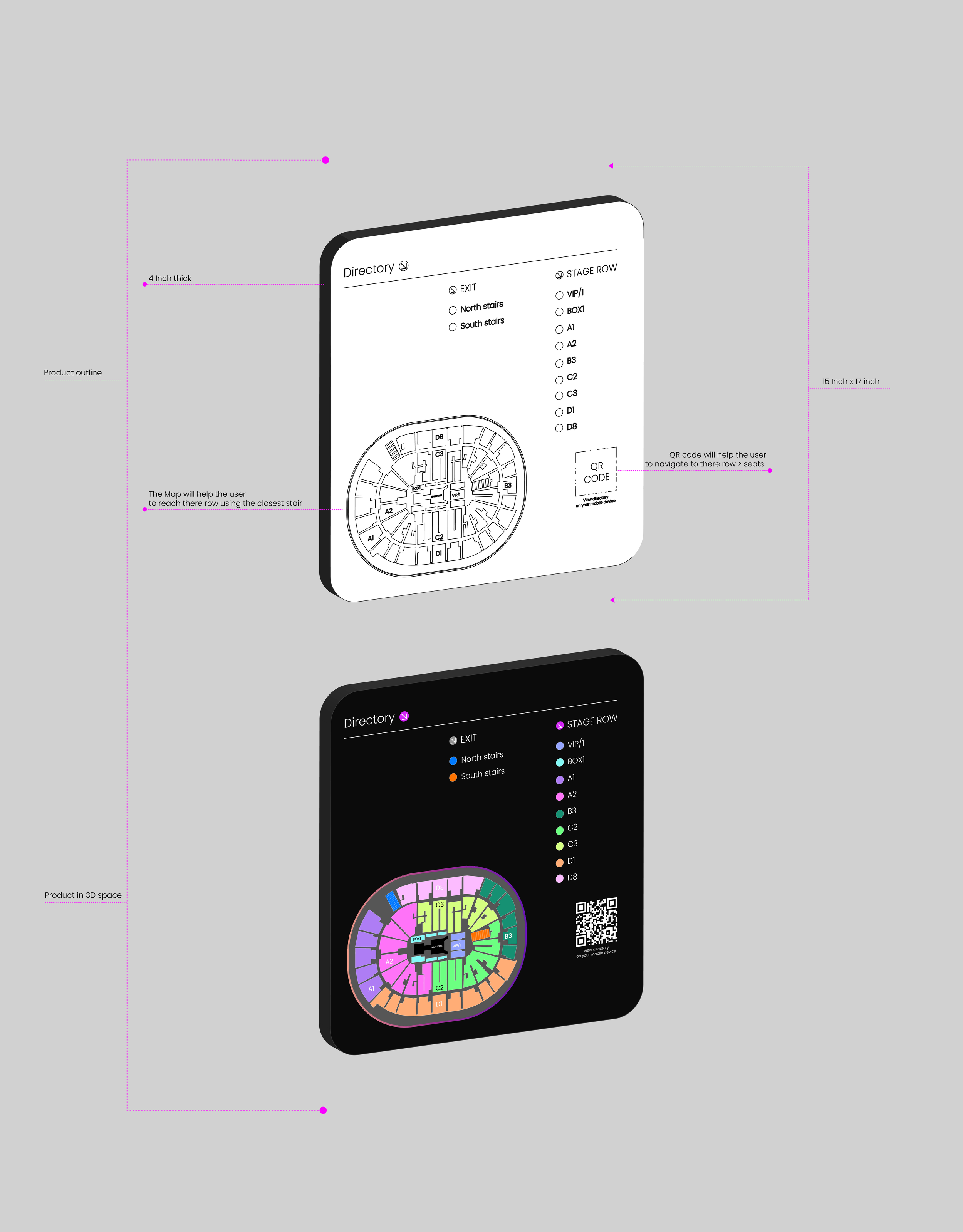
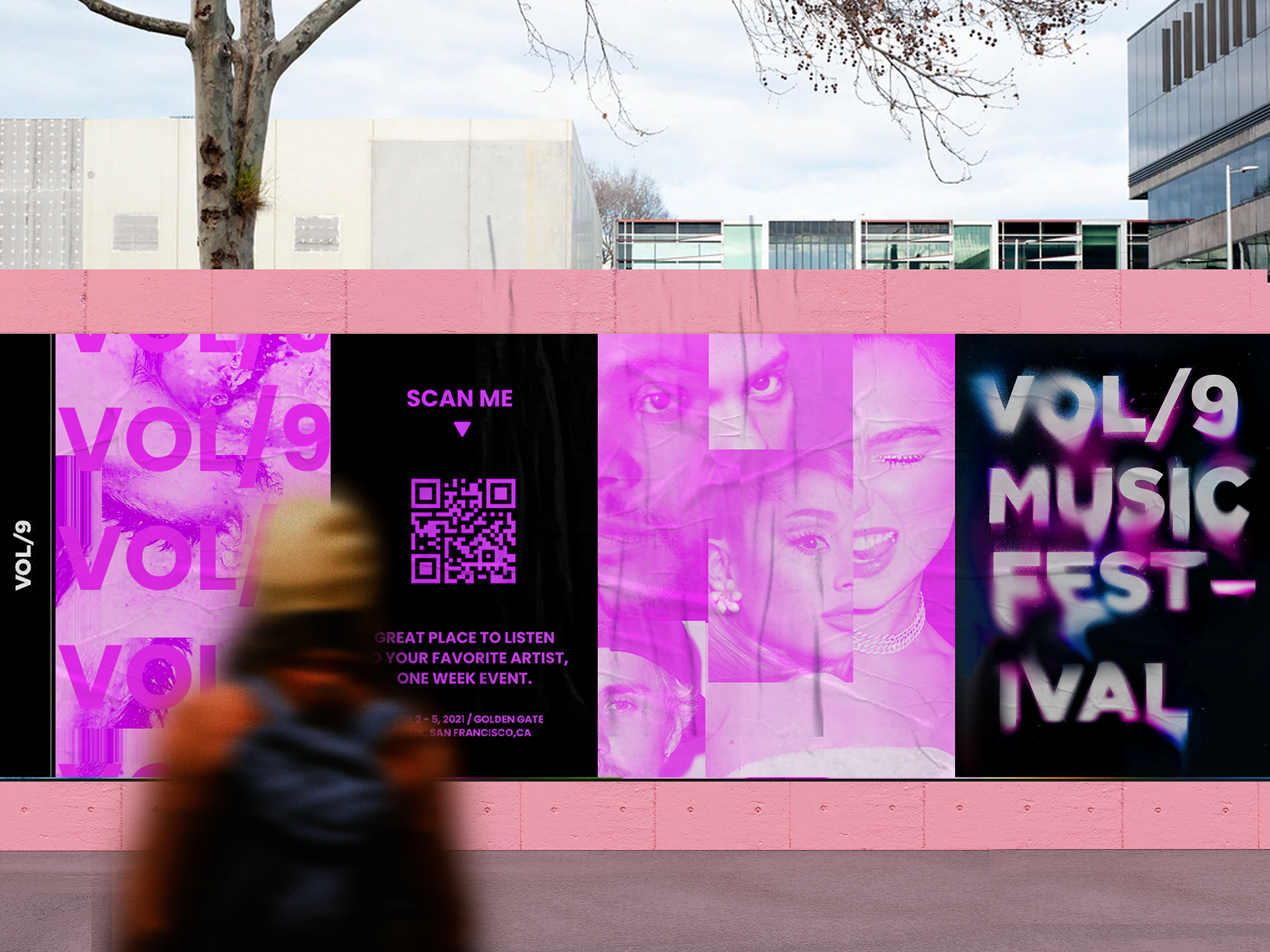
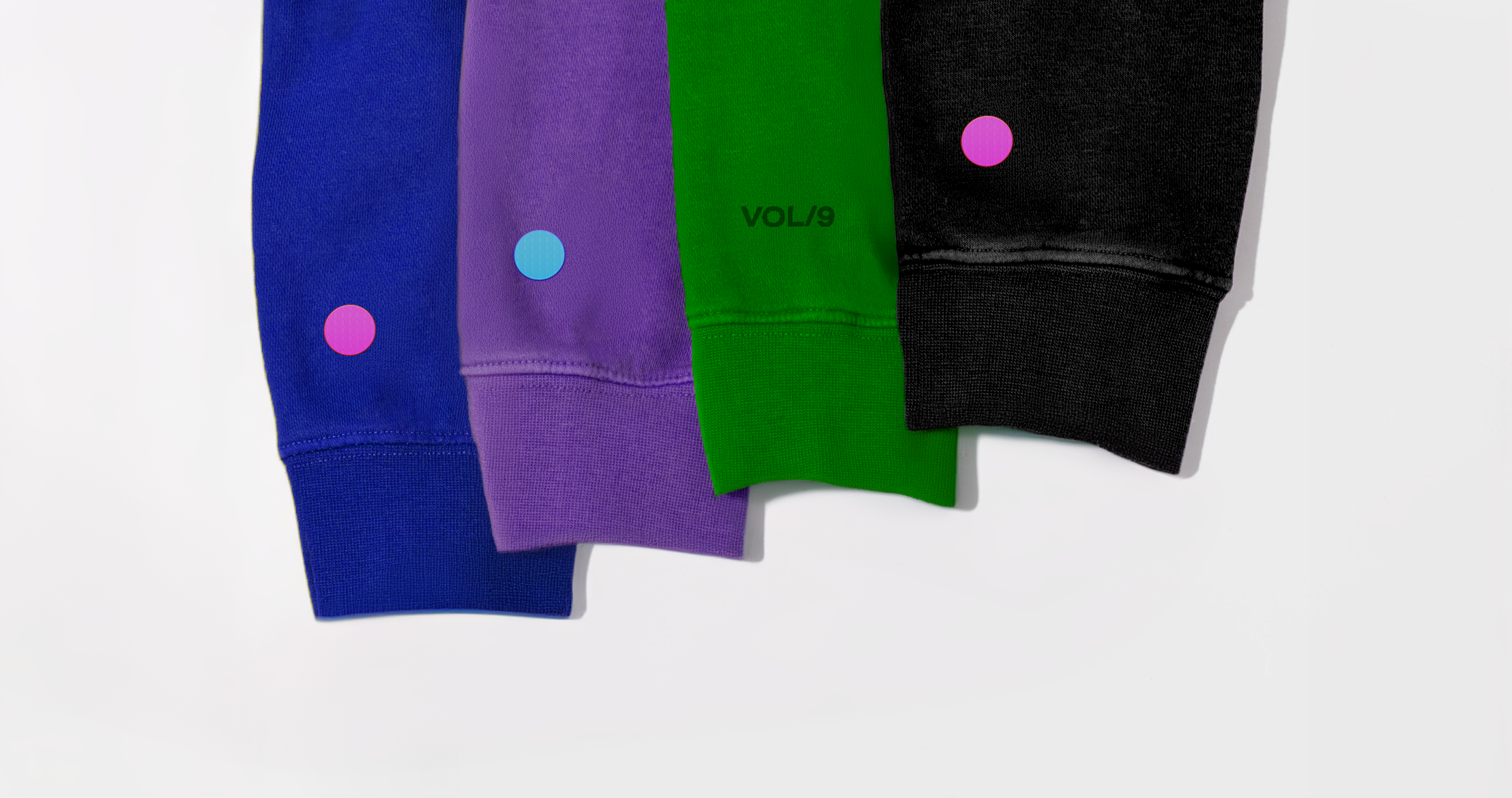
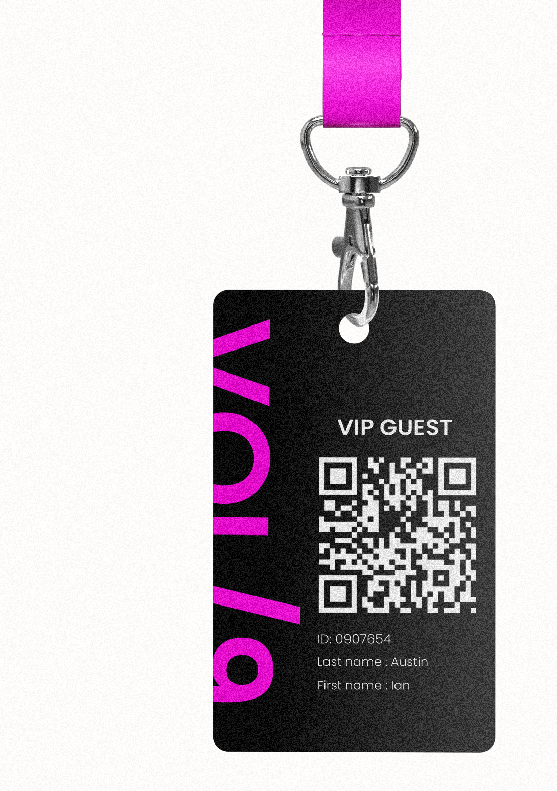
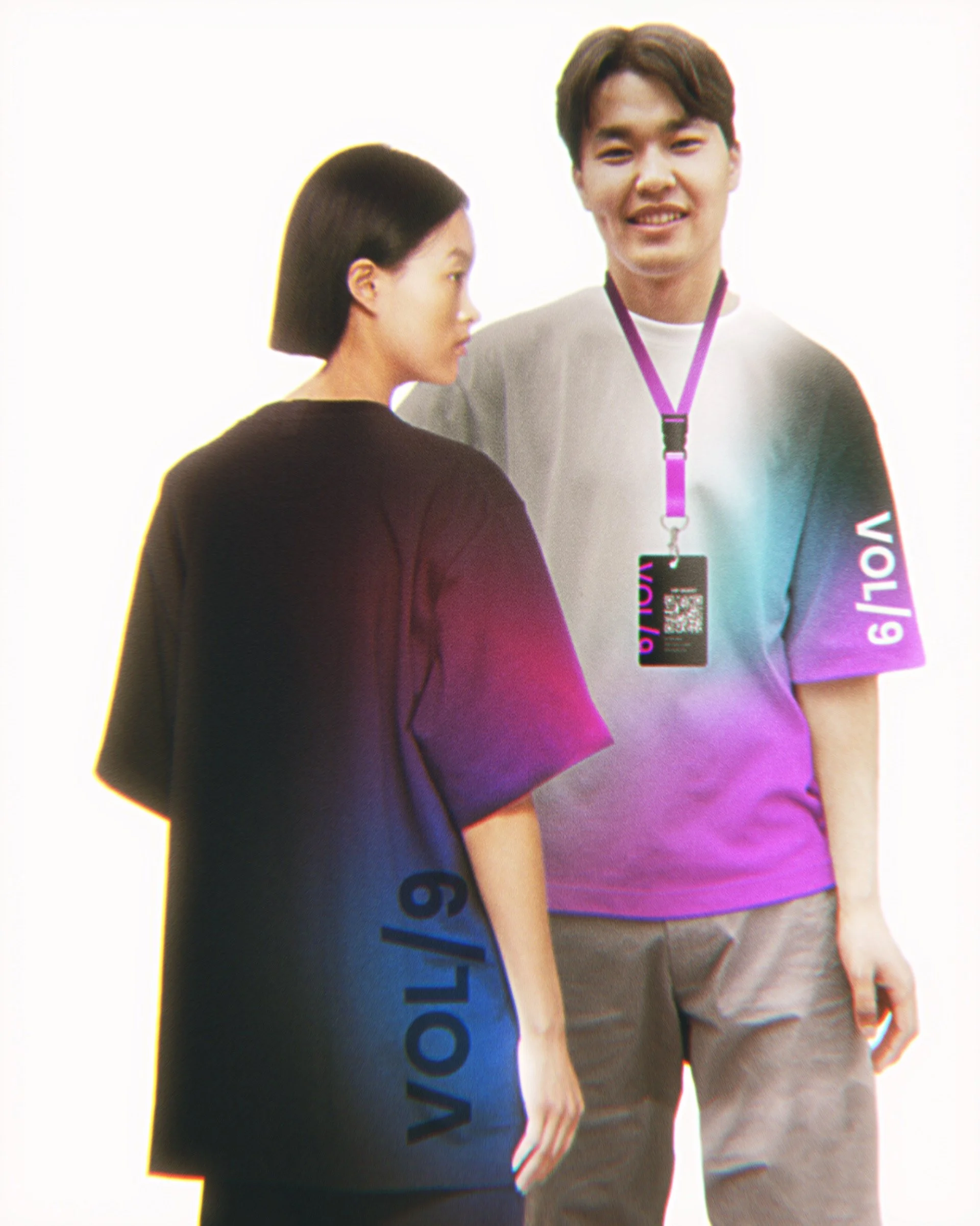
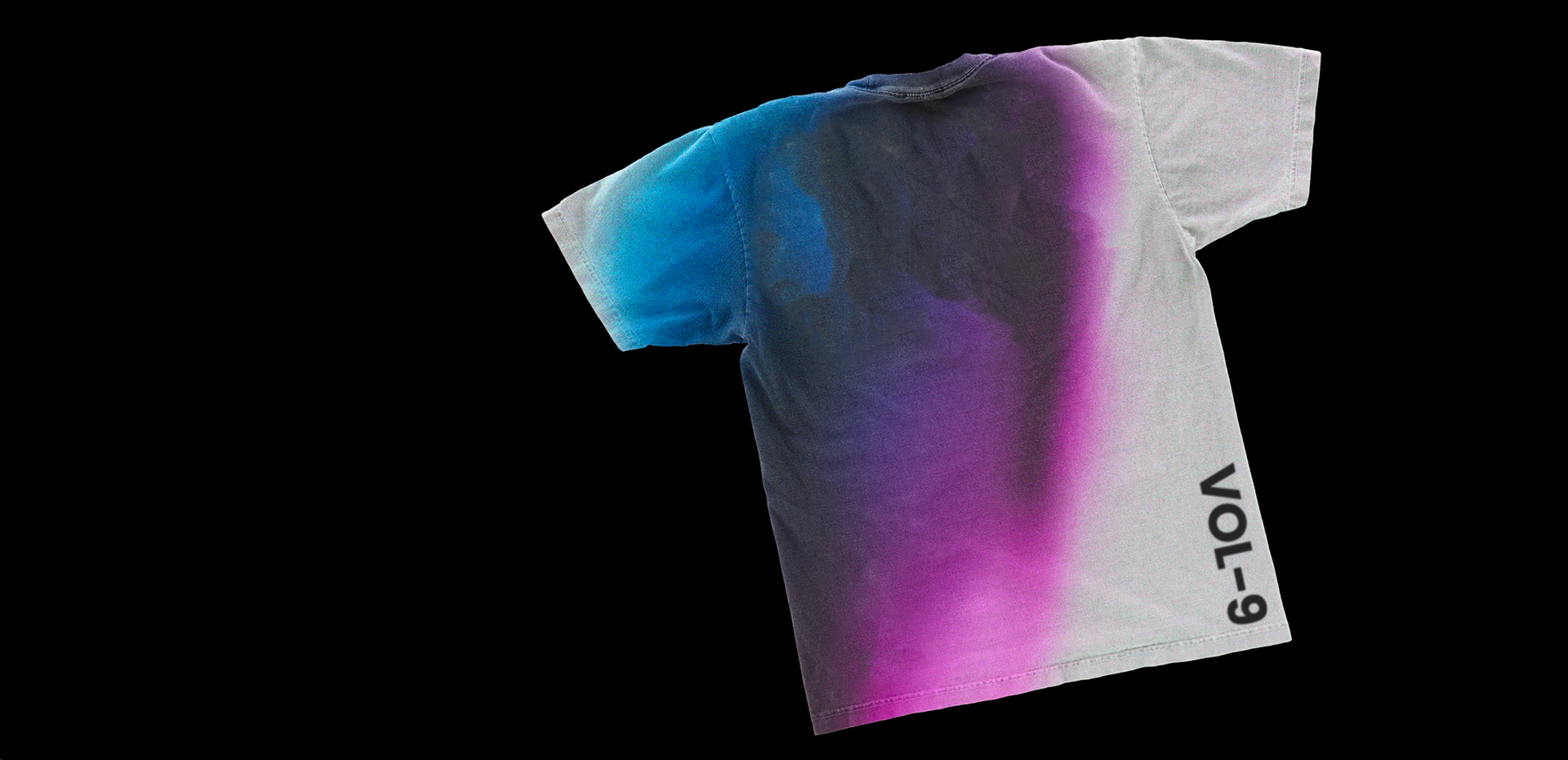
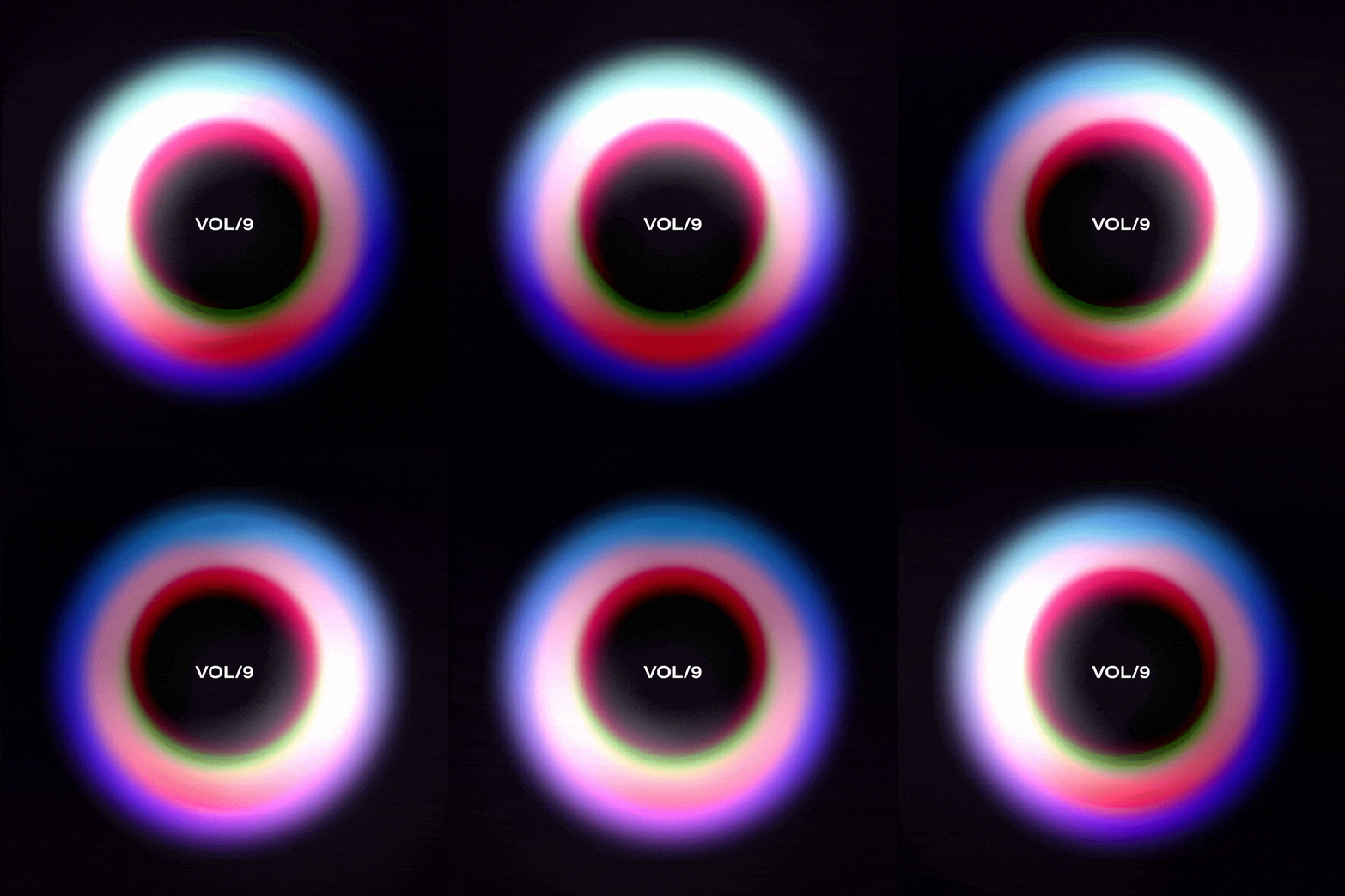
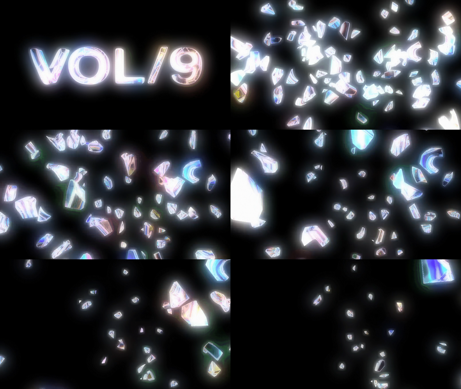
The brand system translates the energy of live sound into a visual language using light, gradients, movement, distortion, scale, and modular graphics. Instead of relying on a single static logo, the identity behaves more like a live performance: flexible, atmospheric, and constantly shifting across signage, digital, credentials, motion, and environmental applications.
Challenge: Create a festival identity that feels immersive and recognizable across a large physical and digital ecosystem.
Design response: Build a flexible visual system inspired by frequency, volume, light, movement, and collective energy.
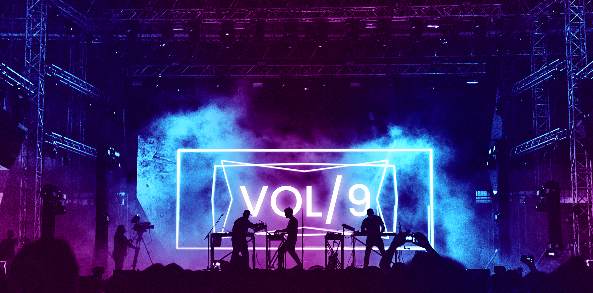

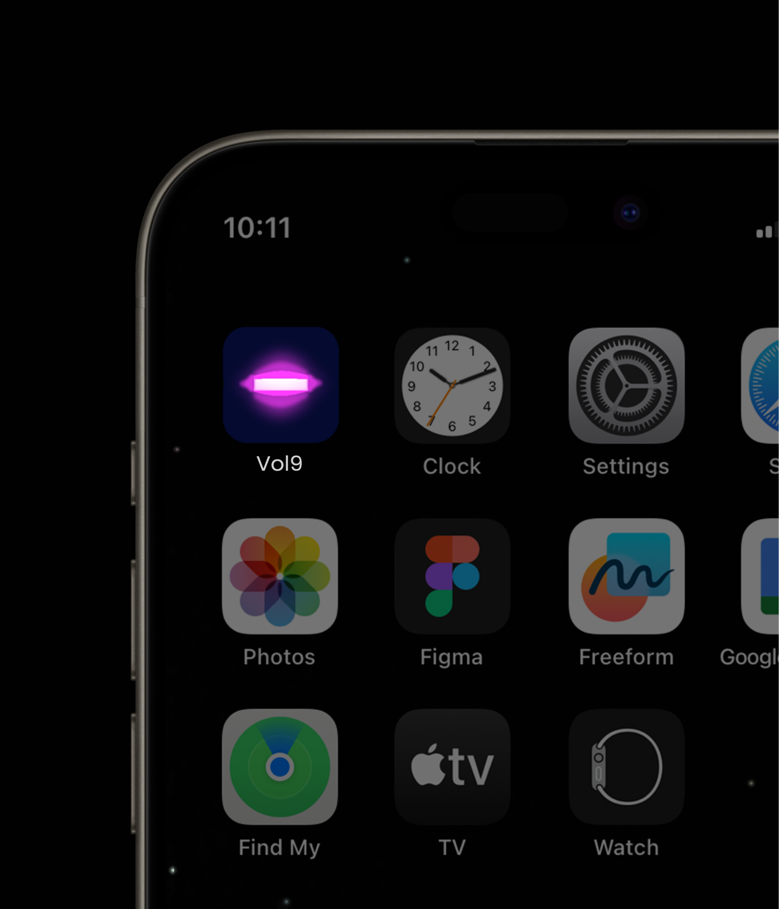
The stage icon, illuminated by a vibrant aura of light, embodies the essence of a music concert experience. It symbolizes the anticipation, energy, and emotional connection between performers and audience. This glowing symbol not only represents the physical stage but also the atmosphere of excitement and shared emotion that music evokes, leaving a lasting impression of the magic found in live performances.
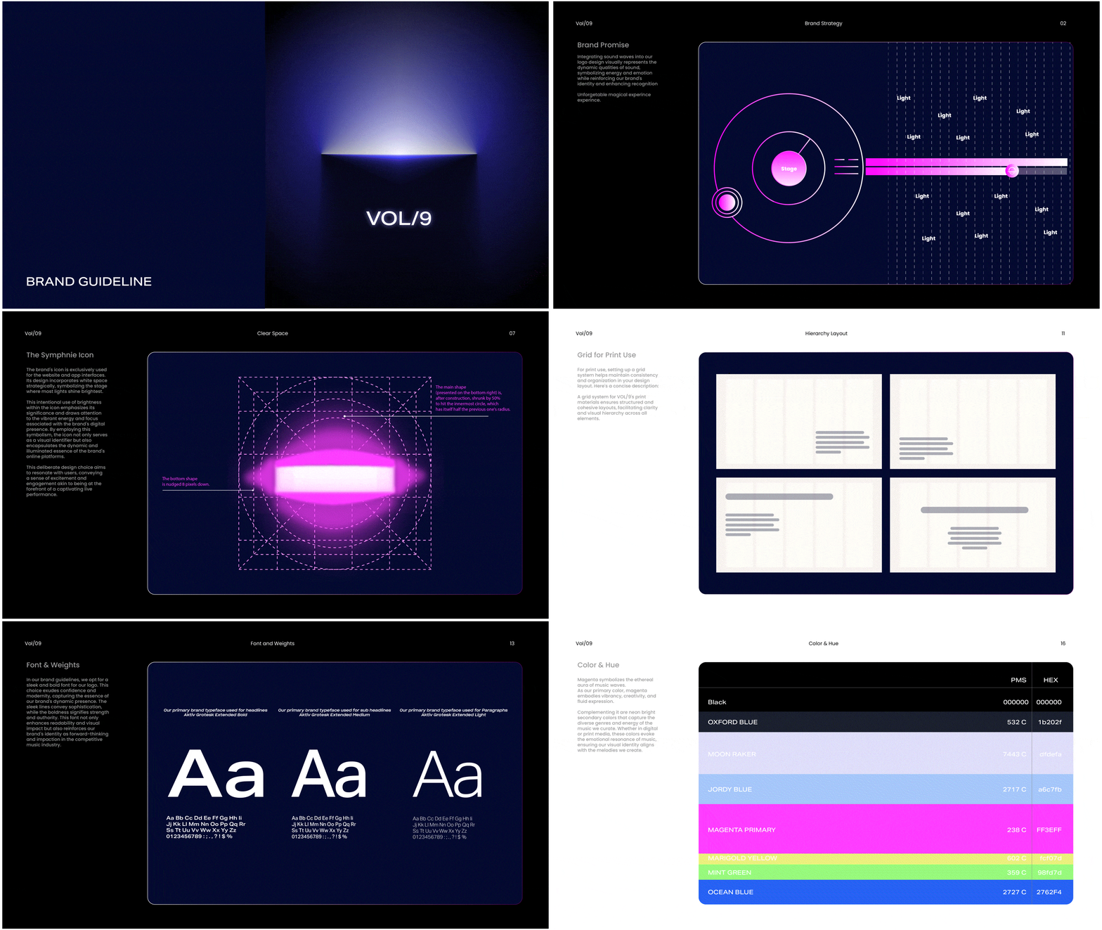
A design system is the blueprint that defines the visual and functional elements of a product or brand, ensuring consistency across all its components. It encompasses guidelines for typography, colors, spacing, and UI elements, fostering a cohesive and user-friendly experience. Beyond aesthetics, a well-crafted design system reflects the essence and identity of a brand, conveying its unique aura through every interaction. This aura is the intangible quality that users perceive, shaping their emotional connection and trust in the product or service . Together, design systems and aura create a harmonious blend of form and feeling, enhancing usability while resonating deeply with users on a visceral level.







Signage for the recently revamped Eastland shopping centre in Melbourne, Australia. Spaceagency was appointed by QIC to rethink the role of Signage and Wayfinding in retail environments. I joined the project at later stages, when the physical designs of the signs had already been approved and were being prototyped, to define the graphic language and layouts for all sign faces. Comprehensive design guidelines and specifications were developed for all interior, car park and back-of-house signage.